
Husky Explorer
Overview
For our class project, my team and I crafted an innovative interactive kiosk application, specially designed to facilitate navigation across the sprawling University of Washington Campus in Seattle.
-
Throughout the duration of this quarter long project, I had the ability to possess the role of a UI/UX Designer, as well as Team Leader. I would love to thank my team for helping me along the way and making this possible!
-
This was a quarter long project, roughly 10 weeks of consistent hard work and iteration.
-
The tools used throughout the duration of this project were Figma, Adobe Photoshop, and Miro!
-
Waseem Khalil, Timothy Low, Summer Delehanty, Camryn Soo, and Ha La
Problem Definition !
Informed by our preliminary research, our aim was to address a spectrum of navigation challenges and pain points, distinguishing our design by seamlessly blending campus wayfinding with comprehensive class and building details.
Problem Definition !
What’s the Problem?
Navigating the University of Washington campus poses a daily challenge for countless students. From locating classrooms to discovering clubs or even locating the nearest restroom, these obstacles significantly shape their overall campus experience and integration into the school community.
Problem Definition !
Testemonial
“As a current junior at the University of Washington, I still have a hard time navigating around this beautiful campus, especially wondering where my next class is at. I am consistently trying to find a solution to enrich and smoothen my navigation experience within this prestigious university. “
Problem Definition !
Design Goals
During our brainstorming sessions for potential design solutions, we formulated a set of design objectives to steer our project in the right direction.
Inclusivity
Create an inclusive environment that allows people with specific needs to locate where they need to go, whether they require a certain kind of bathroom or need to get somewhere as fast as possible due to time constraints.
Easiness
The need to reduce anxiety around getting lost in a new or unfamiliar place,especially with the size of the University of Washington Campus. Also being unable to locate a specific destination.
Fostering Community
Propose to offer relevant and valuable information to everyone on campus to foster a sense of community, making sure everyone is welcome. Additionally, add general awareness of campus conditions.
Design Requirements
After defining our goals, we created specific requirements that our design would need to satisfy.
Indicate the direction of important landmarks on campus.
Display current location of user on campus.
Allow users to view their current schedule with buildings and classroom numbers.
Inform the user of travel time between certain locations.
Provide alerts about construction, outdoor events, congestion, or other obstructions on campus.
Supply information on quickest routes or accessibility concerns to avoid on the way to the user’s destination.
Lay out information about availability of study spaces, places to eat, or water stations within buildings
Problem Definition !
Initial Research !
Drawing from our own experiences grappling with navigation at the University of Washington, we embarked on a thorough investigation into existing navigation methods. This encompassed everything from locating classrooms or offices to finding amenities like drinking fountains and navigating between buildings. Through interviews, persona creation, and the development of a journey map, we pinpointed the precise design challenge we aimed to tackle.
Initial Research !
User Interviews
Each team member engaged in 10-15 minute interviews with distinct University of Washington students, totaling five interviews, to delve deeper into the typical student navigation journey. Interviews followed a semi-structured approach, focusing on three primary topics: buildings, hydration facilities, and restroom locations, aiming to unveil pain points in specific navigation scenarios. Insights from interviewee demographics and content informed the development of our two personas.
5 Interviews
10 - 15 Minutes
3 Topics
Initial Research !
Personas
Following the interviews, we performed thematic analysis to craft two personas named Jerry and Jenni. The accompanying images of the personas are provided below.
Potential user 1: Jerry is a second year full time student, attending University of Washington, Seattle Campus. Majoring in Computer Science.
Jerry is an ambitious, and anxious person who wants to get to class as effective and efficefficient as possible.
Potential user 2: Jenni is a fourth year full time student, attending University of Washington, Seattle Campus. Majoring in Electrical & Computer Engineering.
Jenni is a socialized person who like to explore the campus, but has a bad sense of direction.


Initial Research !
User Journey Map
Once the personas were finalized, we established our objective: to center this 10-week project on enhancing the efficiency and effectiveness of user navigation through campus. Leveraging the user-journey map, we tested our personas to gauge how users might perceive the experience and identified potential obstacles they could encounter.

Initial Designs !
Our final design was constrained to a physical product (not an app or website) as per class requirements. After brainstorming in a group and with classmates, we decided on free-standing kiosks with interactive screens--more functional than static maps, but more practical than individual devices or glasses. We started with storyboards and low-fidelity prototypes to experiment with how that might look.
Initial Designs !
Storyboards
For various scenarios related to navigating campus, our team decided to think through the pain points of the user in each situation. This way we could identify different use cases Husky Explorer could be utilized.
01
02
03
Finding a place to eat: users seating choices for where to eat can be related to noise level, availability, and group size.
Finding a classroom: users' directional decisions are based on physical cues around them, providing prior context can help improve the experience.
Finding a places to study: users make choices based on factors related to availability for where they want to study.

Initial Designs !
Sketches
Before starting a digital model, we worked as a team to sketch three different elements of our final design. We initially each sketched six of our own ideas, then worked together to condense them into a single product: our final sketches focused on the physical design of the kiosk, then screens showing two of our mains flows (navigating to a building and finding amenities and classrooms within a building).


Initial Designs !
Low-Fidelity Prototype
After sketching, we used Figma to show three of our main interactions/flows. We focused on overall layout and structure, rather than aesthetics, so we could test our design usability with potential users. Our flows and sample screen are shown below.


User Testing !
Our team tested our prototype on four different potential users, but only used three of the results due to assignment deadlines. We coded our interview transcriptions and performed a thematic analysis to reach three key findings, which we used to adapt our prototype for usability.
User Testing !
Testing Process
All interviewees were University of Washington undergraduates between the ages of 18-22, with varying degrees of confidence navigating campus. Each interview was approximately 15 minutes and conducted in a public place, with different potential users from the initial interviews. Each user was given three tasks related to the three primary flows, while the interviewer took notes on their body language and reactions. The user was also asked to critique the design and offer recommendations for the final design.
User Testing !
Findings
We conducted thematic analysis from the user testing and resulted in three key findings:
Integrating Course Information
Adjusting path visibility and options in campus navigation
Reorganizing featured amenities and building information
User Testing !
Interface Sketches
After having our lo-fi prototype tested by our users, we sketched out various solutions to the problems defined in the user testings.
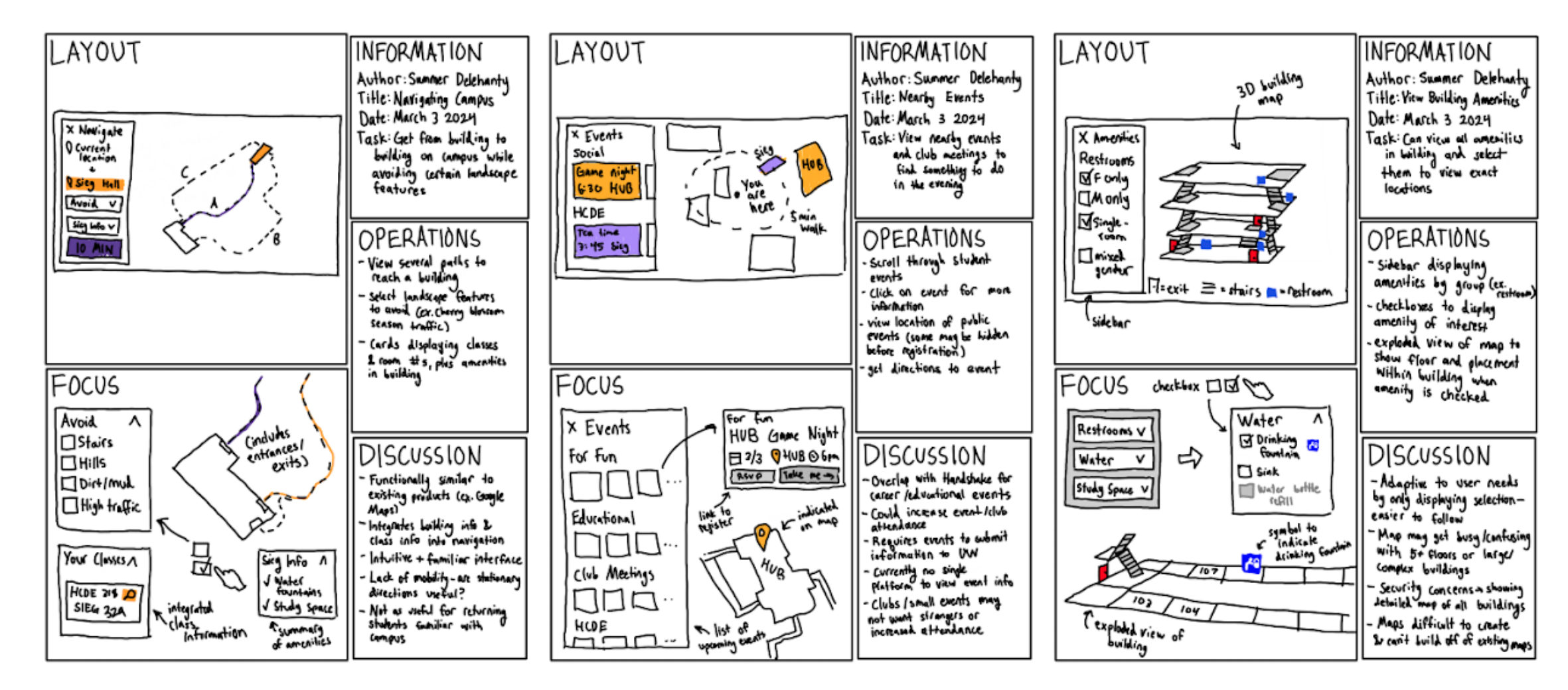

Check out the video below for a full walkthrough of the interface displaying our three critical pathways: finding a route to a building, information about a buildings amenities, and learning more about a users course information.


Final Product !


Final Product !
Strengths & Weaknesses
Our product combines several existing resources into one functional design, allowing users to get all their information in one place. However, due to the stationary nature of a free-standing kiosk, users can't bring their navigation information with them, and instead must rely on their memory or hope that there's another kiosk along their route. Additionally, sensitive course information is displayed on a large screen in a public space, and if a user forgets to sign out anybody could approach the kiosk and see their student information. Finally, although students currently have access to the floor plans of campus buildings, it may be dangerous to display that information to any visitor on campus.
Final Product !
Future Work
Moving forward, a mobile version of this kiosk for students (such as an app) will eliminate some privacy concerns and allow for real-time navigation help, both outside and inside buildings. Kiosks for tourists with more limited building amenity information may still be useful to help them navigate and find public buildings to explore.
Additionally, our design originally included campus events and information, which we weren't able to implement due to time constraints. In the future, our product will also display upcoming student events both by building and date, allowing users to find an event based on their current location.
Lastly, also due to time constraints, the team was unable to prototype the physical version of the kiosk. Future work will focus on the height and format of such a kiosk and important locations to place them around campus.
Reflection
Throughout my journey, I learned many things about being a human-centered design engineer and working in a team. If I could do this project again, I would spend more time on physical prototypes--interfaces are only a part of my ideas, and I wasn't able to test the full functionality of our product. If time permitted, I would've built a model kiosk to include in user testing, to determine user comfort levels with a public kiosk. It was surprising how many digital components our physical product involves, and I found it hard to come up with designs that didn't heavily rely on technology. The most difficult part of this project was working as a large team on a single cohesive design without a product manager, as we didn't have a clear goal until halfway through the project. Additionally, the linear nature of the project meant that the tasks were difficult to divide among five people, or work on as a unit with five different opinions. Despite several holidays during class and absences, we were able to keep each other updated and encourage contribution.